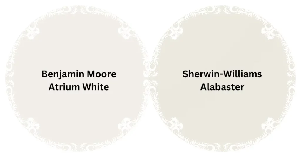
Atrium White and Alabaster are both popular paint colors from Benjamin Moore and Sherwin-Williams, respectively. Atrium White has a subtle pink undertone, while Alabaster presents a warm, almost beige-like hue.
Choosing the right paint color can transform any space, which is why comparing Atrium White vs Alabaster is essential for homeowners and designers. These shades offer unique vibes and can significantly influence the mood and aesthetics of a room. Atrium White, known for its brightness and soft undertones, is perfect for spaces that demand a splash of warmth without overpowering the room.
On the other hand, Alabaster provides a neutral backdrop with its creamy warmth, ideal for a cozy and inviting setting. Understanding the subtle differences between these colors ensures that any room reflects the desired atmosphere and design intention.
The Difference Between Atrium White And Alabaster
Choosing the right paint color can transform a room from dull to dazzling. Yet, as there are a lot of white shades on the market, homeowners and designers often find themselves navigating a sea of seemingly similar options.
Atrium White and Alabaster stand out as popular choices, but they have distinct qualities that set them apart. Discover their individual characteristics and learn how they can either provide a serene backdrop or subtly enhance a space with their specific undertones.
Definition And Composition
Atrium White belongs to the family of bright whites, known for its clean and vibrant feel. Ideal for spaces that demand a fresh and strikingly pure appearance, Atrium White contains just a hint of warmth to avoid a clinical atmosphere. The composition of Atrium White generates a luminous effect that reflects natural light beautifully, energizing a room without overwhelming it.
In contrast, Alabaster is a soft, creamy white that exudes calmness and comfort. It is often praised for its subtle and soothing presence, emulating the natural mineral of the same name. Alabaster’s inclusion of gray and beige undertones provides a velvety smoothness, making it incredibly versatile and harmonious in various settings.
Versatility And Color Undertones
The versatility of these shades stems from their ability to adapt to different aesthetics and lighting conditions. Atrium White, with its almost imperceptible pinkish undertone, can infuse life into a space, particularly when paired with vibrant colors or as a contrast to dark hues. It also thrives in natural daylight, maintaining its purity without turning cold.
| Atrium White | Alabaster |
| Bright and vibrant | Soft and creamy |
| Slight warmth | Gray and beige undertones |
| Luminous effect | Smooth velvety finish |
| Enhances natural light | Evokes calmness and comfort |
Alabaster, on the other hand, provides a neutral backdrop that’s anything but sterile. Its muted undertones make it an amiable companion to a wide array of design elements. From cool metallics to warm woods, Alabaster accompanies textures and complements colors with ease, ensuring a cohesive and inviting atmosphere.
- Atrium White:
- Best for modern, bright spaces
- Ideal for highlighting architectural features
- Excellent with natural light exposure
- Alabaster:
- Suits both traditional and contemporary rooms
- Pairs beautifully with earth tones and soft textures
- Works well in various lighting scenarios
When choosing between these two shades, consider the mood you wish to create, the lighting conditions in your space, and the colors and textures that will surround them. Whether you opt for the bright and airy Atrium White or the calming allure of Alabaster, both can uniquely enhance the character and style of your home.
Atrium White: Exploring Its Unique Characteristics
When it comes to creating a serene and inviting atmosphere in a room, the color of the walls plays a pivotal role. Atrium White, a color often compared to its close counterpart Alabaster, offers a distinctive character that breathes life into any space. This shade of white, known for its subtle nuances, can transform an environment offering a canvas that’s both versatile and timeless. Understanding the unique characteristics of Atrium White will reveal why it’s a top choice for designers and homeowners alike.
Warmth And Light Reflection
The delicate balance of undertones in Atrium White provides a hint of warmth that is often sought after in living spaces. Unlike cooler whites, Atrium White’s soft glow is reminiscent of the gentle embrace of sunlight, making rooms feel cozier and more inviting. This color not only radiates warmth but also excels in reflecting natural light, amplifying brightness in well-lit areas and mitigating the need for artificial lighting.
Aesthetic Appeal In Different Spaces
From contemporary lofts to traditional homes, Atrium White offers a universal appeal that transcends different architectural styles. To illustrate how adaptable Atrium White is, consider the following spaces where its aesthetic appeal truly shines:
- Lively Living Rooms: It creates a backdrop that makes furnishings and art pop, offering a perfect blend of simplicity and sophistication.
- Peaceful Bedrooms: Atrium White’s calming essence contributes to a restful ambiance that promotes relaxation and tranquility.
- Bright Bathrooms: Its ability to reflect light beautifully turns any bathroom into a spa-like oasis, enhancing the sense of cleanliness and purity.
- Inspiring Home Offices: The muted subtlety of this shade fosters concentration and creativity, making it an ideal hue for spaces where focus is paramount.
Regardless of the room, Atrium White offers a unified and polished look, seamlessly blending with decor and enhancing architectural elements.
Alabaster: Unveiling Its Distinctive Features
In the world of paint shades, Alabaster stands out as a color that radiates warmth and tranquility. It’s not just a white; it’s an experience – one that transforms spaces into havens of serenity. Distinct from the pure, stark impression of Atrium White, Alabaster whispers sophistication and charm. Its unique personality can turn walls into a canvas that subtly complements your home’s character. Let’s explore Alabaster’s distinctive features that have made it an enduring favorite among homeowners and interior designers.
Softness And Subtlety
Alabaster possesses an inherent softness that sets it apart from harsher whites. Its slightly warm undertone gives it a gentle luminosity – perfect for creating a cozy and inviting atmosphere in any room. This quality makes Alabaster an excellent choice for spaces where you wish to promote comfort and relaxation, such as bedrooms and living areas. These subtle nuances allow Alabaster to ebb and flow with the day’s changing light, gracefully transitioning from a soft glow in the morning to a rich, creamy tranquility by evening.
Complementary Color Schemes
The versatility of Alabaster is truly showcased when paired with a complementary color scheme. This paint hue shines brightest when used as a backdrop to vibrant pops of color or as an anchor to more muted palettes. Its understated elegance can support a range of styles, from modern minimalism to rustic chic.
- For a Bold Contrast: Pair Alabaster with rich blues or greens; it will stand out while still providing a harmonious balance.
- Soothing Accompaniment: Combine it with soft pastels for a serene and uplifting space.
- Natural Pairings: Use Alabaster alongside natural materials such as wood or stone to evoke an earthy, organic vibe.
Alabaster’s ability to complement a variety of textures and materials further enhances its charm. It works beautifully with natural light, adding spaciousness and airiness to the room. By strategically employing different color schemes, Alabaster adapts subtly, ensuring that every design element gets its moment in the spotlight.
Pros And Cons Of Atrium White
Choosing the right paint color is a crucial decision in any design project, and Atrium White emerges as a strong contender. Renowned for its clean and inviting appeal, this color can breathe life into any space. A classic choice from Benjamin Moore, Atrium White is praised for its purity and freshness, offering designers and homeowners a versatile hue that can lighten up any room. However, as with any color choice, there are both benefits and drawbacks to consider.
Durability And Maintenance
The durability of any paint color is an essential factor, and Atrium White is no exception. This high-quality paint boasts a long-lasting finish that resists fading over time. The natural resilience allows for easy wiping and cleaning, reducing maintenance demands.
Its impeccable coverage quality means fewer coats are needed, making it a durable option. Despite its resilience, lighter shades like Atrium White can reveal imperfections or stains more readily, meaning occasional touch-ups might be necessary to maintain its pristine appearance.
Compatibility With Various Design Styles
One of Atrium White’s standout strengths is its adaptability across various design aesthetics. Whether your decor is contemporary, traditional, minimalist, or eclectic, Atrium White complements the look seamlessly. It acts as a perfect backdrop for statement furniture and art, allowing other design elements to shine.
- Modern: Enhances clean lines and minimalist vibes.
- Traditional: Offers a fresh take on classic styles.
- Rustic: Balances out the warmth of natural textures.
- Bohemian: Serves as a calm counterpoint to boho patterns and colors.
Despite its flexibility, color matching can be a caveat; different lighting conditions can draw out different undertones, potentially clashing with intended palette schemes. It’s advisable to test Atrium White in the intended environment before committing to large-scale applications.
Pros And Cons Of Alabaster
Choosing the right paint color for your space is pivotal; it sets the tone for the entire interior design. Alabaster, a warm but crisp white, has been a perennial favorite among homeowners and designers. Its subtle nuances bring a cozy yet sophisticated vibe to any room. While this shade offers remarkable benefits, it’s crucial to weigh both its advantages and its potential limitations. In this segment, we’ll explore the pros and cons of Alabaster, helping you make an informed decision about whether it’s the suitable shade for your next renovation project.
Resilience And Longevity
Alabaster paint is renowned for its impressive resilience. It is a shade that stands the test of time, both in terms of style and physical durability.
- Easy to clean: Alabaster’s smooth finish makes it easy to wipe down and maintain.
- Resistance to fading: Quality Alabaster paints are formulated to resist fading, ensuring the walls look pristine for longer.
- Timelessness: As a classic color, Alabaster walls retain their relevance despite changing trends.
However, there are a few considerations to keep in mind:
- Light-colored walls can reveal imperfections more readily, requiring meticulous application and maintenance.
- In high-traffic areas, Alabaster may succumb to scuffs and marks, necessitating more frequent touch-ups.
Adaptability In Diverse Interior Settings
Alabaster’s adaptability is another strong suit. This versatile color beautifully complements various design aesthetics and coordinates well with a wide assortment of colors and materials. Here are some of the key benefits:
- Neutral backdrop: Alabaster serves as an ideal canvas for artwork, furniture, and accent pieces.
- Versatile for any room: From bright living spaces to serene bedrooms, Alabaster works everywhere.
- Harmony with other hues: This welcoming color pairs well with both warm and cool tones, offering incredible design flexibility.
While Alabaster’s adaptability is generally a pro, certain considerations are worth mentioning:
- The perception of Alabaster can vary based on lighting, possibly necessitating different lighting setups to achieve the desired effect.
- For those who favor bolder interior colors, Alabaster may seem too tame or require bold accents to bring vibrancy to the space.
Choosing Between Atrium White And Alabaster For Your Space
The quest for the perfect wall color can be a daunting journey – will the serene Atrium White brighten your space like a breath of fresh air or will the soft warmth of Alabaster create the cozy ambiance you’re seeking? Both hues belong to the white spectrum yet evoke different moods and styles. This part of the article is designed to help navigate these subtleties, ultimately illuminating your ideal shade.
Factors To Consider
There are several aspects to consider when choosing a paint color for your interiors:
- Lighting: Observe the way natural and artificial light interact with both shades at different times of the day.
- Existing Decor: Think about how each color will complement your furniture, artwork, and overall design scheme.
- Room Size and Ceiling Height: Lighter shades can make a room feel more spacious and open.
- Purpose of the Room: Envision the mood you want to set. Atrium White is vibrant, whereas Alabaster is soothing.
Professional Tips And Recommendations
Our experts have compiled tips to guide your decision-making process:
| Tip | For Atrium White | For Alabaster |
| Best Used In: | Well-lit spaces that need a pop of brightness | Rooms that serve as a sanctuary; ideal for bedrooms and living areas |
| Complementary Colors: | Bold colors like navy or dark gray | Earthy tones like olive green or taupe |
| Finish: | Semi-gloss for durability and a subtle sheen | Eggshell for a soft, velvety finish |
Ultimately, the choice between Atrium White and Alabaster hinges on desired ambiance and the specific characteristics of your space. Take the time to sample each color in your environment, as this will serve as your best indicator for your final selection.
Conclusion
Choosing between Atrium White and Alabaster boils down to individual preference and specific design needs. Both hues offer a unique charm to any space, ensuring a fresh, inviting atmosphere. Consider your room’s natural light and decor to decide which shade will perfectly complement your home.
With either choice, elegance is guaranteed.

S. Pushon is a paint expert, self-taught artist, and currently working as an adviser in the paint industry as a Quality Improvement and Development Assistant.
An artist by heart, he draws remarkable art pieces and as a professional paint industry individual, he seeks the insight and shares with enthusiasts. Read more…
