Sea Pearl and Classic Gray are both popular paint colors, with Sea Pearl offering a warmer white and Classic Gray providing a neutral gray hue. Homeowners often debate which provides a more appealing and versatile backdrop for their interiors.
Choosing the right paint color is crucial for creating the desired ambiance in any space. Sea Pearl, often used for its warm and inviting qualities, can brighten up rooms while maintaining a soft elegance. On the other hand, Classic Gray is a go-to choice for those seeking a subtle, sophisticated neutral that pairs well with a variety of color schemes and decor styles.
Both colors come from respected paint brands and have become favorites for their ability to create a clean, appealing aesthetic. Whether you’re aiming for a cozy, welcoming vibe or a chic, modern look, the choice between Sea Pearl and Classic Gray will significantly influence the atmosphere of your home. With their understated beauty, both shades embody versatility, but the final selection hinges on the specific mood and design objectives of the homeowner.
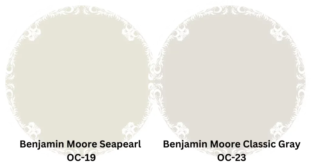
Seapearl Vs Classic Gray: Understanding The Differences
Embarking on a home renovation journey requires a keen eye for detail, especially when it comes to choosing the perfect paint color for your space. Picking between Seapearl and Classic Gray may seem daunting, but with a better understanding of the differences, you’ll be able to make an informed decision that enhances your home’s aesthetics. Let’s dive into the unique qualities each color brings to the table, focusing on their undertones and warmth, as well as their versatility in design application.
Undertones And Warmth
Seapearl, a color crafted by Benjamin Moore, has a serene and oceanic feel, as its name suggests. It’s characterized by soft, creamy undertones that exude a subtle hint of warmth. This warmth allows Seapearl to project a cozy atmosphere while maintaining a clean, sophisticated look.
In contrast, Classic Gray is another popular hue from Benjamin Moore that carries a neutral base with a slightly cool undertone. Despite being gray, it avoids feeling too cold or industrial due to its welcoming softness. The innate warmth in this gray prevents it from being overly stark, providing a tranquil and inviting environment.
Versatility In Design
The beauty of Seapearl lies in its versatility. It harmonizes effortlessly with a multitude of design elements and can serve as a backdrop for both traditional and contemporary styles, making it a multi-purpose palette pleaser. From pairing with bold accent colors to complementing natural wood tones, Seapearl adapts to a variety of settings and themes.
Classic Gray, on the other hand, boasts a profound adaptability that allows it to blend with diverse design aesthetics. Whether it’s the cornerstone of a minimalistic approach or a complement to vibrant patterns, Classic Gray’s balanced shade offers a timeless base for a wide array of design choices. The harmony it creates is unsurpassed in creating a cohesive space that feels both grounded and airy.
To illustrate how Seapearl and Classic Gray perform in varied design contexts, consider the following breakdown:
| Color | Works Well With | Best for Styles |
| Seapearl | Natural textures, vibrant shades, soft pastels | Coastal, Modern Farmhouse, Shabby Chic |
| Classic Gray | Metal finishes, monochromatic schemes, bold patterns | Modern, Scandinavian, Minimalist |
Grasping the nuances of Seapearl and Classic Gray can transform your environment. As we continue to explore the uniqueness of each color, remember that choosing the right shade will elevate your home’s design to the next level.
Evaluating Color Psychology
Colors speak a silent language that influences our emotions and behaviors. Whether it’s the serene vibe of a Seapearl-painted living room or the sophisticated ambiance of an office done in Classic Gray, the hues we choose for our spaces can have a profound psychological impact. Journey through a world of color as we unpack the subtle, yet powerful effects of Seapearl and Classic Gray on our psyche. Understanding these nuances is essential for anyone who wants to create an environment that resonates with the desired sentiment and purpose.
Psychological Impact Of Sea Pearl
The color Seapearl, much like its namesake, evokes a sense of calmness and purity. Often associated with the tranquility of the ocean and the serenity of a pearl, this color can create a soothing environment which is highly beneficial in areas intended for relaxation and unwinding. Let’s dive into the psychological effects of embracing Seapearl:
- Calming Influence: Its connection with the sea conjures a peaceful ambiance, reducing stress and creating a sanctuary for the mind.
- Freshness: The crisp quality of Seapearl brings an air of freshness and cleanliness, a nod to new beginnings and organized spaces.
- Subtle Elegance: Associated with sophistication, the understated elegance of Seapearl infuses spaces with a timeless charm.
Psychological Impact Of Classic Gray
In contrast, Classic Gray is the quintessential neutral that brings a balance to any color palette. This versatile hue carries psychological implications that can enhance the ambiance of any room. Classic Gray’s impact on our mood includes:
| Effect | Description |
| Stability: | A sense of steadiness and security, promoting a solid foundation for any interior decor. |
| Neutrality: | Acts as a backdrop that allows other colors to stand out, evoking a balanced and harmonious feel. |
| Sophistication: | Classic Gray is often linked with refined and stylish designs, suitable for a professional or personal setting. |
Both Seapearl and Classic Gray have their unique attributes. The selection between calming Seapearl and poised Classic Gray should align with the desired emotional outcome of a space. Paint with purpose, and let the color psychology guide the mood of your rooms.
Considering Lighting Factors
The ambiance of space can dramatically transform with different paint choices, with Seapearl and Classic Gray being two popular contenders. Yet, a critical aspect that often goes unnoticed is the lighting. Whether it’s the gentle caress of natural sunlight or the precise glow of artificial lighting, these factors can influence the true essence of your color choice. Let’s delve into how both natural and artificial light can impact the appearance of Seapearl and Classic Gray on your walls.
Impact Of Natural Light
Natural light has the power to reveal the true character of paint colors. As the day progresses, the changing angle of the sun will alter the perception of Seapearl and Classic Gray:
- Morning Light: Expect a soft and warm glow that can make Seapearl appear more radiant, while Classic Gray may take on a gentle beige tone.
- Midday Sun: The high intensity of noon light can wash out lighter colors like Seapearl, yet can make Classic Gray stand out with its depth.
- Evening Dusk: As the sun sets, both colors can deepen, with Seapearl giving off a creamy warmth and Classic Gray showing a cozy, inviting hue.
Rooms with south-facing windows capture more intense light, possibly brightening both colors, while those with north-facing windows might display these paints in their cooler, more subtle forms.
Impact Of Artificial Light
When the sun sets, artificial lighting takes the stage. The type of bulbs and their placement can significantly influence the paints’ appearance:
| Lighting Type | Effect on Seapearl | Effect on Classic Gray |
| Incandescent Bulbs: | Enhance the creamy undertones in Seapearl | Bring out warm, rich tones in Classic Gray |
| LED Bulbs: | Can skew Seapearl to a cooler spectrum | May cause Classic Gray to exhibit a more neutral stance |
| Halogen Lights: | Mimic daylight, keeping Seapearl’s integrity | Accentuate the crisp clarity in Classic Gray |
It’s also crucial to consider the color temperature of artificial light, where warmer tones tend to enhance coziness and cooler tones highlight the paints’ crispness. Remember, the wattage and positioning of artificial lighting fixtures can cast shadows or create an even light distribution, affecting your perception of Seapearl and Classic Gray.
Practical Applications In Interior Design
The colors we choose to adorn our interiors not only reflect our personal taste but can also have a profound impact on the ambiance and feel of a space. When selecting the perfect paint for your next design project, the serene ‘Sea Pearl’ and the timeless ‘Classic Gray’ offer distinct moods and stylistic potentials. Each shade serves different practical applications in interior design, providing an array of options from modern aesthetics to classic enchantments.
Sea Pearl In Modern Interiors
Sea Pearl, with its gentle tones and airy essence, is exceptionally suited for modern interior designs that aim to create a light and cohesive space. This color thrives in open floor plans, highlighting clean lines and minimalist decor:
- Accentuate Spaciousness: Light walls can make rooms appear larger, and Sea Pearl enhances this effect with its subtle warmth.
- Complements Contemporary Art: Against Sea Pearl’s neutral backdrop, vibrant artworks, and statement pieces demand attention.
- Natural Light: Reflecting natural light, this hue brightens rooms and creates a seamless flow with outdoor views.
But it’s not just about walls. Consider furniture and accessories in Sea Pearl to add a touch of modernity to any room.
Classic Gray In Traditional Interiors
Classic Gray paints a picture of elegance and time-honored style, making it the quintessential choice for traditional interiors. This versatile hue brings forward the rich textures and ornate details typical of classic decor:
- Supports Rich Fabrics: Fabrics like velvet or silk pop against Classic Gray, offering a sophisticated canvas.
- Highlights Woodwork: Trim, molding, and hardwood floors in warm woods are gracefully framed by Classic Gray’s neutral tone.
- Creates a Calming Retreat: In bedrooms and living areas, Classic Gray sets a tranquil stage for relaxation and elegance.
Considering cabinetry and shelving? Classic Gray infuses depth and gravitas into traditional spaces.
Furnishing and Accessories: Intricate patterns and antique pieces pair seamlessly with Classic Gray, enhancing the overall aesthetic of a traditionally styled interior.
Exploring Complementary Color Schemes
When imagining the perfect palette for your space, the power of complementary color schemes cannot be overstated. These are colors opposite each other on the color wheel, pairing cool with warm to create a balanced and visually appealing look. Sea Pearl and Classic Gray are versatile shades that can enrich any room with their subtle elegance. While Sea Pearl exudes a crisp, serene vibe, Classic Gray offers a soothing, timeless aura. Let’s dive into the ideal pairings that will elevate these colors to create a harmonious design in your environment.
Ideal Pairings With Sea Pearl
Sea Pearl, with its hint of aqua, brings a fresh, oceanic feel to spaces. To complement this hue, consider these pairings:
- Nautical Navy: Deep blues contrast with Sea Pearl’s lightness, providing maritime sophistication.
- Coral Blush: Add warmth to Sea Pearl’s coolness with soft coral notes, perfect for a vibrant yet relaxed look.
- Earthy Greens: Shades of sage or olive ground the airy Sea Pearl, bringing nature’s palette indoors.
To showcase the versatility of this color, incorporate metallic accents such as bronze or gold for a hint of glamour or opt for crisp white trim for a clean, cohesive finish.
Ideal Pairings With Classic Gray
Classic Gray is the quintessential neutral, offering a warm, inviting canvas for endless creative expression. Pair it with:
- Bold Black: Create a striking modern contrast with sleek black furniture or accents.
- Soft Pastels: Pastel tones like baby blue or pale pink soften the gray, ideal for a gentle, romantic ambiance.
- Vibrant Teals: For a pop of color that complements yet stands out, teal throws or artwork breathe life into Classic Gray settings.
Wooden elements work well with Classic Gray, adding texture and warmth, while silver or chrome details can sharpen the look with a contemporary edge.
Maintenance And Longevity
When selecting the right color for your space, not only the aesthetic appeal but the maintenance and longevity of the paint or finish are crucial factors to consider. Beyond the initial pleasure of a fresh look, savvy homeowners and decorators think long-term. Understandably, durability and ease of upkeep play significant roles in determining the suitability of colors like Sea Pearl and Classic Gray for your living or work environments.
Durability And Resilience Of Sea Pearl
Sea Pearl, with its natural and calming hue, is not just pleasing to the eye but also boasts impressive durability. Perfect for rooms with a significant amount of wear and tear, Sea Pearl has a reputation for being:
- Scratch-resistant: Less susceptible to showing scrapes and minor damage.
- Stain-resistant: Its ability to repel most household stains means it retains its pristine appearance longer.
- Easy to clean: A simple wipe-down with a damp cloth usually does the trick.
This color’s resilience makes it a superb choice for families and high-traffic areas, ensuring that its beauty endures various challenges of daily life.
The formula that carries the Sea Pearl pigment is engineered for extended durability. The high-quality binders in the paint provide a robust protective layer, safeguarding the color from fading and ensuring that the walls look freshly painted for years to come.
Durability And Resilience Of Classic Gray
Classic Gray exudes a timeless elegance that has made it a perennial favorite. Renowned for its adaptability, it also epitomizes strength in the following ways:
- Resistant to fading: Especially important in areas exposed to sunlight.
- Mildew-resistant: A vital feature for maintaining a healthy indoor environment.
- Washable finish: Makes maintenance a breeze, even in spaces prone to spills and splashes.
Classic Gray maintains its charm and polished look, even when subjected to the rigors of day-to-day activities, making it ideal for households seeking both style and substance.
Its maintenance is straightforward, facilitating a living space that remains consistently inviting with minimal effort. High-quality paints in this shade are particularly designed to resist wear, reducing the need for frequent touch-ups or repaints.
Cost And Value
When selecting the perfect hue for your space, evaluating the cost and value of your paint choices like Seapearl and Classic Gray is crucial. Both colors are mainstays in interior design for their versatility and timeless appeal; but when it comes to budget considerations and the longevity of your investment, it’s important to dig a little deeper. Aspects such as coverage, paint quality, and the potential impact on property value all play a part in determining the true cost-effectiveness of these popular shades.
Budget-friendly Options
For those keen on minimizing upfront costs without sacrificing quality, it’s beneficial to consider the paint options available for both Seapearl and Classic Gray. Given that these are sought-after colors, several paint brands offer comparable hues at varied price points. To make the most budget-friendly decision, compare:
- Paint prices per gallon across different brands
- Promotions or discounts at local or online retailers
- The volume of paint needed depending on wall absorbency and area coverage
Do-it-yourself applications can further reduce expenses. By investing in quality tools and educating yourself on proper painting techniques, you can achieve professional-looking results without the professional price tag.
Long-term Investment
Analyzing long-term value is paramount when choosing between Seapearl and Classic Gray. A color’s ability to stand the test of time in both style and durability contributes to its value. Higher-quality paints with superior pigmentation and longevity might have a higher initial price, but they can prove more cost-effective over the years.
| Aspect | Seapearl | Classic Gray |
| Aesthetic Lifespan | Timeless, adaptable to decor changes | Classic, maintains appeal with trends |
| Retouching Frequency | Lower with high-quality options | Lower with high-quality options |
| Potential to Increase Home Value | High, popular among buyers | High, often sought-after for its neutrality |
Investing in a resilient paint finish pays off by avoiding the need for frequent touch-ups or repaints, keeping maintenance costs low. Over time, both Seapearl and Classic Gray can enhance real estate value; neutral shades are highly marketable and can be the deciding factor for future buyers.
Environmental Considerations
When choosing the perfect paint for your home, the aesthetic appeal often takes center stage, but environmental considerations are equally critical. With an increased emphasis on sustainability, it’s important to ponder how your color choices, like Seapearl and Classic Gray, can influence the environment. This section highlights the eco-friendliness of each paint color, ensuring you make an informed decision that aligns with your environmental values.
Eco-friendliness Of Sea Pearl
Sea Pearl, with its soothing tones reminiscent of natural oceanic landscapes, not only brings serenity to your walls but also contributes positively to the environment. Paints reflecting this color often feature low VOC (Volatile Organic Compounds) levels, which means fewer emissions disrupting the air quality. Brands offering Sea Pearl options typically emphasize sustainable practices, including:
- Utilizing water-based formulations to minimize solvent use
- Incorporating recycled materials in packaging
- Engaging in responsible waste management during the production process
These measures ensure that choosing Seapearl has a reduced environmental impact, providing a wall color that’s as friendly to the planet as it is visually appealing.
Eco-friendliness Of Classic Gray
The timeless hue of Classic Gray is not just a trendsetter but also a shade that can boast environmental benefits. Paint manufacturers who produce Classic Gray shades are increasingly adopting eco-friendly practices such as:
| Eco-Friendly Feature | Benefits |
| Non-toxic ingredients | Healthier indoor air quality and reduced pollution |
| Renewable resources | Limits depletion of non-renewable materials |
| Energy-efficient production | Decreases carbon footprint and conserves energy |
By opting for Classic Gray paint that follows such standards, homeowners can enjoy a stylish space that also prioritizes ecological responsibility.
Conclusion
Deciding between Seapearl and Classic Gray isn’t simple. Each paints a unique ambiance, complementing different decor styles. Your choice hinges on personal aesthetics and room function. Remember, samples in varied lighting help. Trust your instinct, and create a space that feels like home.

S. Pushon is a paint expert, self-taught artist, and currently working as an adviser in the paint industry as a Quality Improvement and Development Assistant.
An artist by heart, he draws remarkable art pieces and as a professional paint industry individual, he seeks the insight and shares with enthusiasts. Read more…
