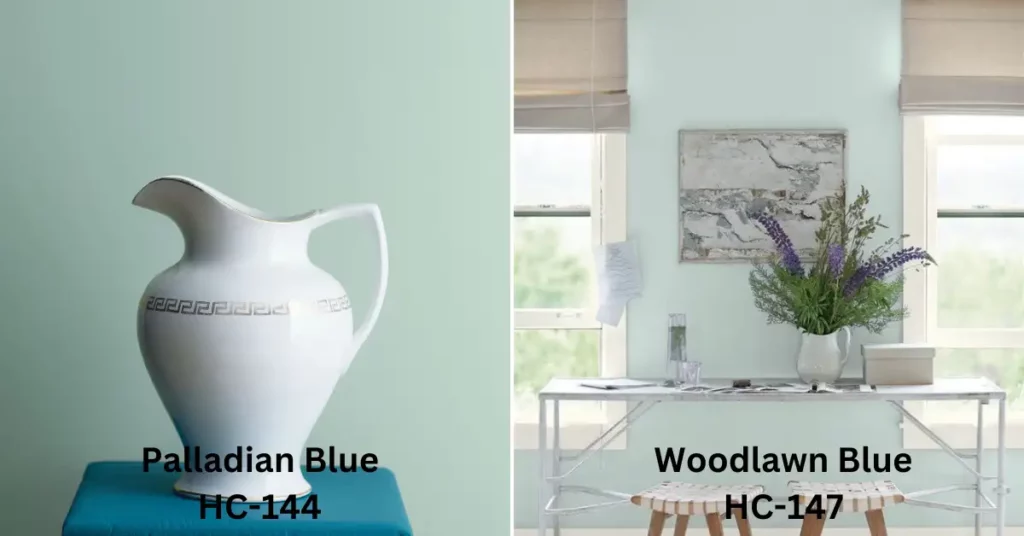
Choosing the right paint color for a room can be a daunting task. The options are endless, and a single shade can have multiple variations that can alter the entire vibe of a room. This is where Palladian Blue and Woodlawn Blue from Benjamin Moore come in.
Although these two shades might look similar at first glance, they have some distinct differences that make them unique and suitable for different rooms and moods.
Today we will discuss the differences between Palladian Blue and Woodlawn Blue, including their undertones, hue, saturation, light reflectance, room size, decor style, complementary colors, trim color, natural light, and mood.
The Differences Between Palladian Blue vs Woodlawn Blue
Palladian Blue and Woodlawn Blue are two beautiful shades of blue often used in interior design and decoration. In spite of their apparent similarity, there are some key differences between the two that can significantly impact the overall look and feel of a room.
Undertone
One of the most notable differences between Palladian Blue and Woodlawn Blue paint is their undertone. Palladian Blue has a blue-green undertone that brings a sense of freshness and vibrancy to any room it is used in.
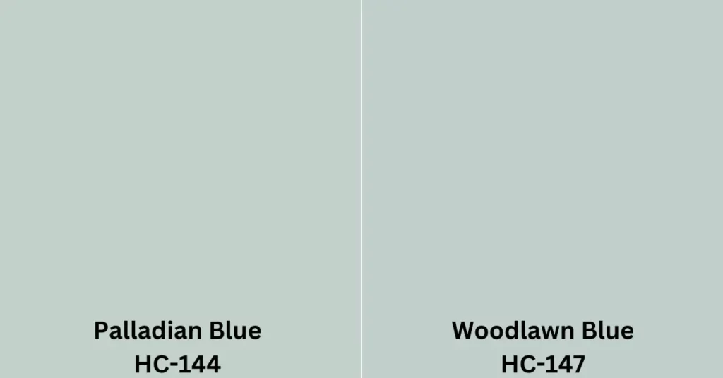
Conversely, Woodlawn Blue has a green & gray undertone that gives it a more muted and subdued appearance. While both are considered cool colors, the difference in undertones affects the mood and ambiance of the room.
Hue
Palladian Blue is a lighter and brighter color compared to Woodlawn Blue. Its higher luminosity level gives it a more cheerful and optimistic feel that energizes the space.
On the contrary, Woodlawn Blue is a more restrained and conservative color that exudes a sense of tranquility and calmness. These subtle variations in hue can significantly impact a room’s overall aesthetic and mood.
Saturation
Palladian Blue is a highly saturated color that is rich and vibrant, while Woodlawn Blue is less saturated, giving it a softer and more subtle effect. The saturation level can impact how the color appears on different surfaces and in various lighting conditions.
In general, highly saturated colors tend to be more intense and lively, while less saturated colors can create a more relaxing and soothing atmosphere.
Light Reflectance
Another difference between Palladian Blue and Woodlawn Blue paint is their light reflectance values (LRV). Palladian Blue has a higher LRV of 60, making it a brighter color that reflects more light. This makes it an excellent choice for small rooms, as it can make them appear more spacious and open.
Meanwhile, Woodlawn Blue has an LRV of 60.11, which is still considered a light color. But, it is not as bright as Palladian Blue and may work well in larger rooms or those with limited natural light.
Room Size
There is a significant impact that color can have on the perceived size of a room. In general, lighter and brighter colors tend to make a room appear larger, while darker and more muted colors can make it seem smaller.
With its higher luminosity and light reflectance, Palladian Blue is an ideal choice for smaller rooms as it can create a more expansive and airy atmosphere.
In contrast, Woodlawn Blue’s more subdued and muted appearance can make it work well in a larger room, where its cool tones can add a sense of sophistication and elegance.
Decor Style
The decor style of a room can also impacts the choice of color. Palladian Blue works well with both traditional and modern decor styles due to its versatility.
Its blue-green undertone can work well with warmer colors like yellows and reds and cooler tones like blues and greens.
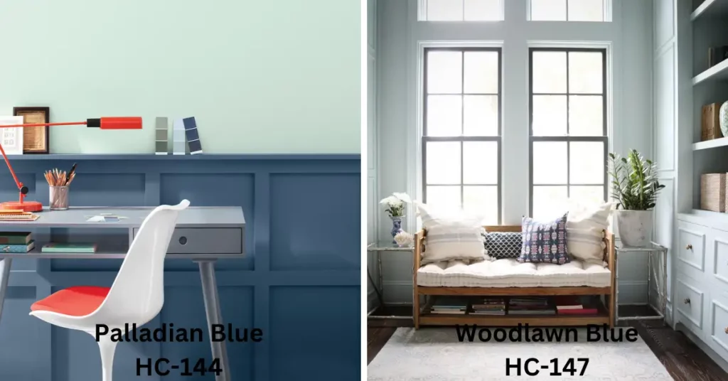
Woodlawn Blue is more suited to rustic or coastal decor owing to its green & gray undertone that pairs well with natural textures like wood and wicker.
Complementary Colors
The complementary colors of paint can affect any room’s overall aesthetic and impact. Palladian Blue pairs well with warm colors like yellows and reds, bringing a sense of vibrancy and liveliness to the space.
On the other hand, Woodlawn Blue works well with cooler colors like grays and greens, creating a more relaxed and calm ambiance.
Trim Color
The trim color can significantly affect how the color appears on the walls. Palladian Blue pairs beautifully with crisp white trim, creating a stark contrast that enhances the vibrancy of the color.
Meanwhile, Woodlawn Blue works well with soft, off-white, or cream-colored trim, creating a more soothing and subdued effect.
Natural Light
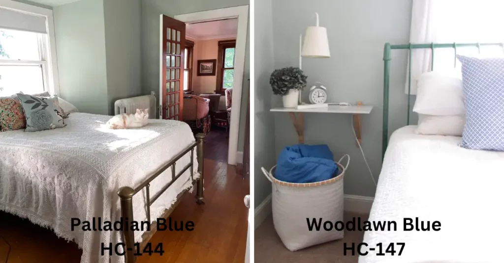
The amount of natural light in the room can also affect the color of the walls. Palladian Blue looks best in rooms with plenty of natural light, bringing a sense of vibrancy and energy to the space.
Woodlawn Blue can work well in rooms with limited natural light, creating a more subdued and calming effect.
Mood
Finally, the choice of color can significantly impact the mood and ambiance of a room. Palladian Blue has a refreshing and calming effect that can create a sense of energy and optimism in the space. Woodlawn Blue creates a more relaxed and cozier atmosphere perfect for unwinding after a long day.
Comparison Table of Palladian Blue vs Woodlawn Blue:
| Feature | Palladian Blue | Woodlawn Blue |
| Undertone | Blue-green | Green-gray |
| Hue | Lighter and brighter | Muted and subdued |
| Saturation | Highly saturated | Less saturated |
| Light Reflectance Value (LRV) | 60 | 60.11 |
| Room Size | Better for smaller rooms | Better for larger rooms |
| Decor Style | Traditional and modern | Rustic or coastal |
| Complementary Colors | Warm colors such as yellows and reds | Cooler colors such as grays and greens |
| Trim Color | Crisp white | Soft off-white or cream |
| Natural Light | Looks best in rooms with plenty of natural light | Can work well in rooms with limited natural light |
| Mood | Refreshing and calming | Relaxed and cozy |
How Might You Incorporate Palladian Blue and Woodlawn Blue into A Single Room Design?
Incorporating Palladian Blue and Woodlawn Blue into a single-room design can create a beautiful, cohesive look.
One way to do this is by using one color as the primary wall color and the other as an accent color. For example, you could paint the walls Palladian Blue and use Woodlawn Blue for accent pieces such as throw pillows, curtains, or a statement piece of furniture.
Another option is to use both colors in equal measure throughout the room. For instance, you could paint half the walls with Palladian Blue and the other half with Woodlawn Blue or use a striped or patterned wallpaper that incorporates both colors.
To tie the look together, use complementary colors in your decor, such as warm yellows and oranges for Palladian Blue or cool grays and greens for Woodlawn Blue.
Palladian Blue or Woodlawn Blue: Choosing the Perfect Shade for Your Space Has Never Been Easier
In deciding between Palladian Blue and Woodlawn Blue from Benjamin Moore, several factors should be considered, such as undertones, hues, saturations, light reflectance, area size, decor style, complementary shades, trim colors, and moods.
Both shades are beautiful and create a calming and soothing atmosphere, but they have some unique characteristics that make them suitable for different spaces and moods. By understanding these differences, you can choose the perfect shade to create the ambiance you desire in your space.
So why not try both Palladian Blue and Woodlawn Blue from Benjamin Moore? Each offers a unique look that can enhance the beauty of any room. From subtle pastels to bright blues, these classic hues can help you create a stylish space with an inviting atmosphere.

S. Pushon is a paint expert, self-taught artist, and currently working as an adviser in the paint industry as a Quality Improvement and Development Assistant.
An artist by heart, he draws remarkable art pieces and as a professional paint industry individual, he seeks the insight and shares with enthusiasts. Read more…
