Choosing the right color is very important for home design. Gray is a popular choice for modern homes because it looks good and can be used in many ways. From the many shades of gray available, Coventry Gray vs. Stonington Gray stands out as two that can help you make your living areas feel calm and elegant.
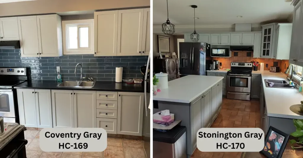
In this article, we’ll look at the differences between Coventry Gray and Stonington Gray. This will help you decide which color will work best for your design goals.
Coventry Gray: Elegance in Simplicity
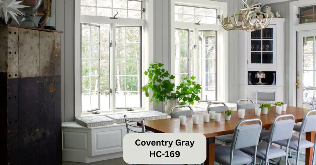
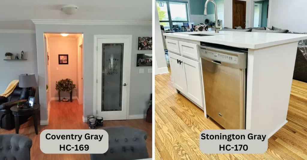
Coventry Gray, also known as HC-169, is a classic, elegant shade that effortlessly blends modern and traditional aesthetics. This medium-toned gray carries a subtle warmth, making it an excellent choice for creating a cozy and inviting atmosphere. Whether used as an all-over wall color or as an accent, Coventry Gray shows sophistication.
One of the standout features of Coventry Gray is its adaptability to different lighting conditions. It keeps its refined elegance in well-lit rooms while it creates a sense of coziness in spaces with limited natural light. This adaptability ensures that Coventry Gray remains a consistent and reliable choice for various areas of your home.
Stonington Gray: Tranquil Sophistication
Stonington Gray, also known as Hc-170, leans slightly cooler on the color spectrum and shows a sense of tranquility and modern sophistication. This light gray shade is almost chameleon-like, shifting between warm and cool undertones based on surrounding colors and lighting.
The versatility of Stonington Gray allows it to shine in various design styles. In contemporary spaces, it blends beautifully with sleek lines and minimalist decor. It serves as a refreshing and updated take on the classic neutral in more traditional settings.
Coventry Gray vs. Stonington Gray: Know The Differences
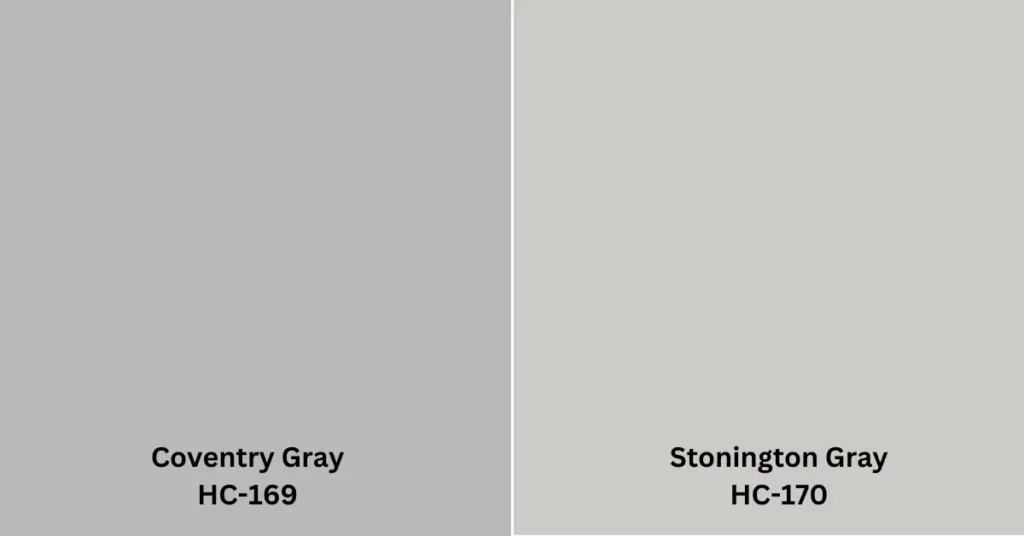
Here are some of the key differences between Coventry Gray and Stonington Gray:
- Color palette: Coventry Gray has a slightly warmer undertone than Stonington Gray. This is because Coventry Gray has a hint of green in its palette, while Stonington Gray has a hint of blue.
- Undertone: Coventry Gray has a slightly green undertone, while Stonington Gray has a slightly blue undertone.
- Light reflection: Coventry Gray reflects more light than Stonington Gray. This is because Coventry Gray is a lighter gray paint color.
- Overall appearance: Coventry Gray is slightly warmer and more inviting than Stonington Gray. This is due to its warmer undertone and lighter color.
Table of Differences:
| Specification | Coventry Gray | Stonington Gray |
|---|---|---|
| Light Reflectance Value (LRV) | 48.18 | 59.36 |
| RGB Values | R: 184, G: 186, B: 182 | R: 202, G: 203, B: 197 |
| Hex Code | #B8BAB6 | #CACBC5 |
| Undertones | Warm taupe and beige undertones | Cool blue and green undertones |
| Dominant Tone | Subtle warmth | Tranquil coolness |
| Atmosphere | Cozy and inviting | Serene and sophisticated |
| Versatility | Adaptable in various lighting conditions and settings | Seamless transitions between rooms in open-concept spaces |
| Ideal Spaces | Living rooms, bedrooms, and cozy spaces | Living rooms, bathrooms, kitchens, open-concept areas |
Here is a table that summarizes the key differences between Coventry Gray and Stonington Gray:
Color Combinations
Colors can create emotions and determine the mood in our homes. Combining colors intelligently can improve the look of a room in interior design. Let’s explore the color combinations of Coventry Gray and Stonington Gray:
Coventry Gray Color Combinations:
Let’s begin our color exploration with a delicate and soothing combo.
- Coventry Gray and Soft Lavender Bliss:
Coventry Gray’s warm undertones harmonize beautifully with soft lavender. Use Coventry Gray as the main wall color to create a cozy ambiance, and add touches of soft lavender through furnishings and decor. Think lavender throw pillows, curtains, and even a rug. - Coventry Gray and Bold Emerald Glamour:
Coventry Gray and rich emerald green add drama and richness. The green embellishments sparkle on the stylish gray canvas. Coventry Gray on walls and upholstery, emerald green on statement furniture like an armchair or exquisite side table. This combo is luxurious and sophisticated. - Coventry Gray and Rustic Terra Cotta Warmth:
Pair rustic terra cotta with Coventry Gray for earthy feelings. Terra cotta’s rich colors and Coventry Gray’s warmth create a homey, inviting atmosphere. Use Coventry Gray on walls, accents, and terra cotta in pottery, ceramics, and textiles. This combination works well in kitchens, dining rooms, and rustic environments.
Stonington Gray Color Combinations:
Stonington Gray’s adaptable nature makes it an ideal companion for ocean-inspired hues.
- Stonington Gray and Ocean Blue Serenity:
Imagine a peaceful coastal hideaway in your home room. Use Stonington Gray to show off its cold undertones and add ocean blue accents like vases, artwork, and pillows. This palette will bring seaside peace to your environment. - Stonington Gray and Blush Pink Delight:
Stonington Gray and blush pink create a lovely mood. The cold gray and warm pink contrast gives depth and visual intrigue to your space. Use Stonington Gray on walls and blush pink on beds, cushions, and wall art. This combination is ideal for bedrooms, nurseries, and other charm-filled spaces. - Stonington Gray and Classic Navy Sophistication:
Pair Stonington Gray with navy blue for an elegant palette. Use Stonington Gray as the main hue with navy blue accents in furniture, rugs, and decorations. This combination is perfect for elegant living spaces, home offices, and dining rooms.
Choosing Between Coventry Gray and Stonington Gray:
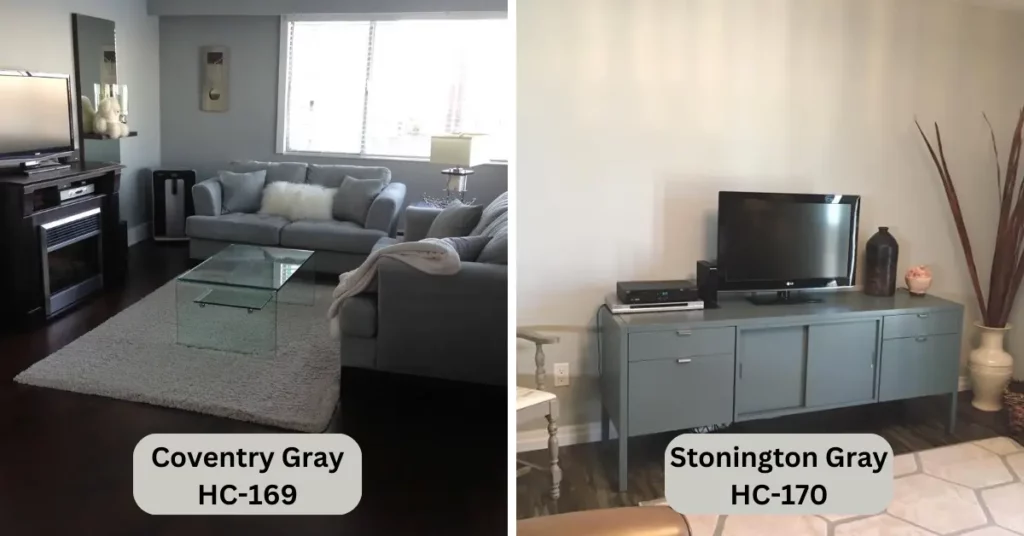
Making the decision between Coventry Gray and Stonington Gray ultimately depends on your personal preferences and the specific mood you wish to create in your home. Here are some key factors to consider when choosing between these two enticing shades:
- Lighting: If your space receives enough natural light, Coventry Gray’s warm undertones could enhance the welcoming ambiance. For rooms with limited light, Stonington Gray’s cool undertones might help brighten the space.
- Furnishings: Consider the colors of your furniture and decor. Coventry Gray’s versatility complements both bold and neutral hues, while Stonington Gray’s adaptable undertones can play off existing color palettes.
- Mood: Think about the atmosphere you want to achieve. Coventry Gray’s warmth adds a touch of coziness, whereas Stonington Gray’s tranquility brings a sense of calm sophistication.
- Accents: The color of your accents, such as throw pillows, curtains, and artwork, can influence your choice. Coventry Gray can provide a bold backdrop for vibrant accents, while Stonington Gray can create a serene canvas for delicate details.
Additional things to consider:
- The size of the room: If you have a small room, you might want to choose a lighter gray paint color, such as Coventry Gray. This will help to make the room feel larger. You can choose a darker gray paint color, such as Stonington Gray if you have a large room. This will help to create a more dramatic effect.
- The style of your home: If you have a traditional home, you might want to choose a gray paint color with a warmer undertone, such as Coventry Gray. If you have a modern home, you might want to choose a gray paint color with a cooler undertone, such as Stonington Gray.
- The other colors in your home: When choosing a gray paint color, it’s important to consider the other colors in your home. You want to choose a gray paint color that will complement the other colors in your home, not clash with them.
Final words:
For timeless gray in your house, Coventry Gray and Stonington Gray are great choices. Coventry Gray’s elegance and versatility make it great for creating a welcoming setting, while Stonington Gray’s serene sophistication complements many design styles. Choose a tint that matches your design goal by considering your space’s lighting, furnishings, mood, and accents. Regardless of your choice, Coventry Gray and Stonington Gray will add flair and sophistication to your interiors.
I hope this article has helped you to decide which gray paint color is right for you. If you have any further questions, please feel free to leave a comment below.

S. Pushon is a paint expert, self-taught artist, and currently working as an adviser in the paint industry as a Quality Improvement and Development Assistant.
An artist by heart, he draws remarkable art pieces and as a professional paint industry individual, he seeks the insight and shares with enthusiasts. Read more…
