In the midst of a plethora of paint brands and color combinations, choosing the right one for your home or other places is a strenuous job. Amongst all the brands, the two most popular and loved paint brands are Sherwin-Williams and Benjamin Moore.
While being confused over Accessible Beige vs Edgecomb Gray, you can dig deep into the article to find out which one you should go for your painting job.
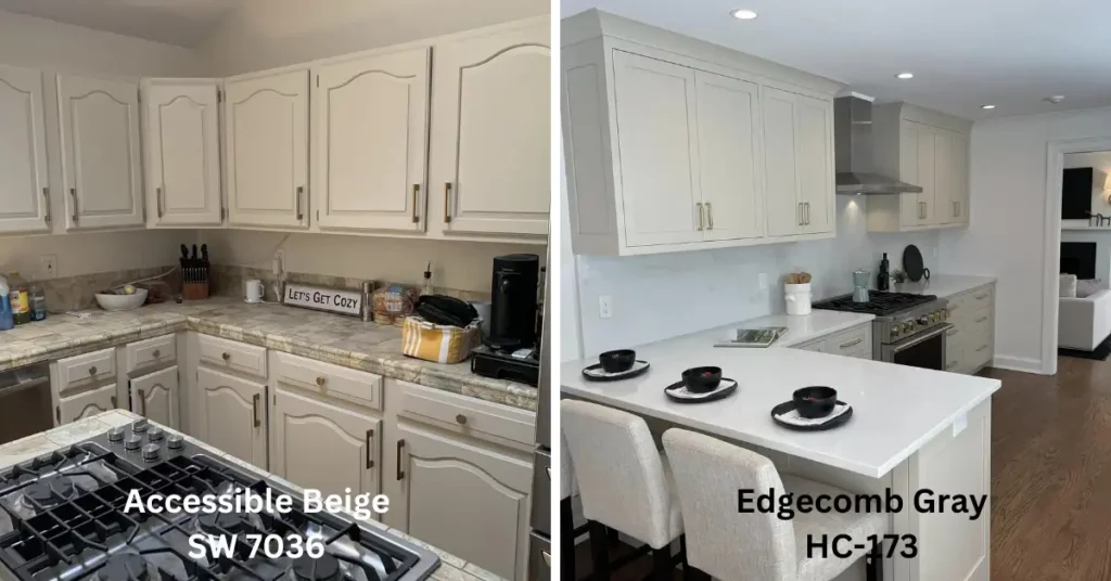
Sherwin-Williams’ Accessible Beige
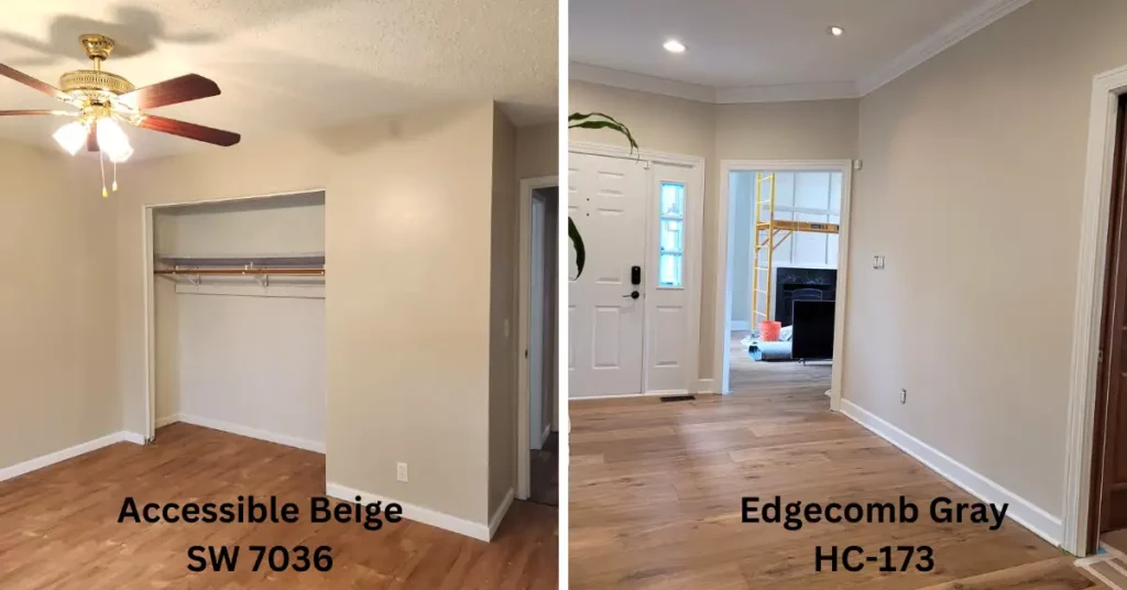
Accessible Beige comes in the category of greige which refers to gray + beige. This paint has a combination of warm beige and cool gray. It’s soft, perfectly neutral with a subtle undertone of gray, and works in different lighting situations.
One of the striking features that sets this paint apart from others is its ability to adapt to different lighting situations. Depending on the light available in your room, it can provide you with a warmer and cooler appearance. This quality makes it a versatile choice for you, whether you have natural or artificial light at your place.
Another advantage that you will get for accessible gray is that it pairs well with other paints such as whites, blues, grays, and earth tones. You can use it as a primary color on your wall or an accent color depending on the effect you desire to get.
You can use this paint in your living rooms, bedrooms, or in common places where you desire to get a warm and inviting atmosphere.
Benjamin Moore’s Edgecomb Gray
Edgecomb gray falls under the category of neutral gray colors and has gained popularity for its versatility and ability to work well in a variety of lighting conditions. Like accessible beige, edgecomb gray is also an optimal greige color. Edgecomb gray HC-173 is a soft and timeless color that you can use as the main color as well as an accent or trim color.
One of the most amazing features of Edgecomb Gray is that this paint can complement many other colors. Its neutral nature allows it to blend well with warm or cool tones. You can use it in different styles and color schemes.
You can create a soft and inviting atmosphere in your room with Edgecomb Gray’s light to mid-tone color. This paint is from Benjamin Moore’s historical collection inspired by colors found in classic architecture and design.
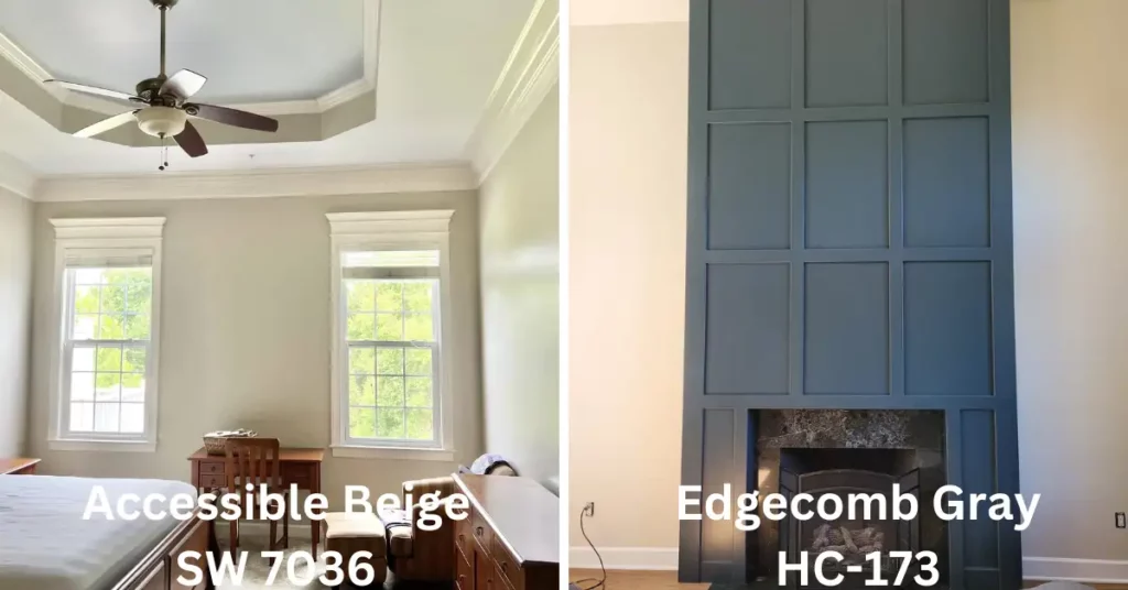
Accessible Beige vs Edgecomb Gray: Know the differences.
Though there are a lot of common features between Accessible Beige and Edgecomb Gray, they are different in many ways. Let’s have a look at the table below to know the differences at a glance.
| Features | Accessible Beige | Edgecomb Gray |
| Undertones | Warm Undertones with a hint of yellow and orange | Neutral Undertones with a touch of greige |
| Light Reflectance | Reflects more light, creating a brighter atmosphere. | Reflects less light giving a softer appearance. |
| Depth | Deeper and richer hue | Lighter and more airy |
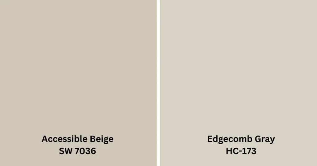
| Hue | Warm Beige with a slight tan undertone | Greige with a balanced mix of beige and gray. |
| LRV ( Light Reflectance Value) | 58 | 63 |
| RGB Value | R: 206, G: 196, B: 181 | R: 209, G: 201, B: 191 |
| Dry time | Dry to touch 1-2 hours, recoat 4 hours | Dry to touch 1-2 hours, recoat 4 hours |
| Mood | Warm and Inviting | Calm and Neutral |
| Lighting Conditions | Adapts to different lighting condition | May appear slightly different in various lighting |
| Complementary | Pairs well with earthy tones, warm reds, and gold. | Matches nicely with cooler grays and blues |
Accessible Beige vs Edgecomb Gray: Your ultimate choice
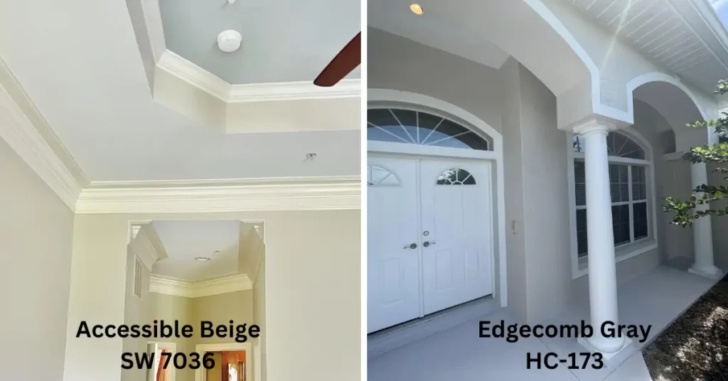
If you wonder which one you should use in your room, you need to consider a few things first. You need to understand the lighting at your place, is it natural or artificial? Whether you want a warm or cool color is also a factor. And also the design and style of your place are also important things to consider.
There are some other factors that you can take into consideration.
Lighting: Lighting of your room can significantly impact how your paint color will appear. You should consider the amount and direction of natural light as well as the artificial light
Undertones: You need to consider that both these paints have undertones. While accessible beige has warm undertones, leaning towards yellow or beige, edgecomb gray has a greige (gray-beige) undertone. Consider the existing element in your room, such as furniture, flooring, and fabrics, to ensure that the undertones of the chosen paint color complement or coordinate well with them.
Room Size and Function: The size and purpose of your room are also crucial in selecting the right color. Accessible beige is a versatile neutral color that can make a smaller room cozy. While Edgecomb Gray’s lighter and softer tone can create an airy and spacious feel.
Color Scheme: Determine the overall color scheme or theme you want to achieve in your space. Accessible Beige and Edgecomb Gray are both neutral colors that can work well with various color palettes. Consider the other colors you plan to incorporate, such as furniture, artwork, and accessories, and ensure they harmonize with your chosen paint color.
Samples and Swatches: It’s always recommended to test paint colors before making a final decision. Get sample pots of Accessible Beige and Edgecomb Gray and paint small sections on different walls of the room. Observe the colors throughout the day under different lighting conditions to see how they interact with your space.
Personal Preference: Ultimately, your personal preference and style should play a significant role in the decision. Consider your own taste and the mood you want to create in the room. Do you prefer a warmer, earthy tone (Accessible Beige) or a softer, more muted color (Edgecomb Gray).
So, considering all these factors you can choose which paints are appropriate for your home decor.
Final Words:
Accessible beige and Edgecomb Gray are two versatile paint colors that can give you the ultimate ace to painting your home. If you want to give your space a gray look, both these paints are excellent choices for you.
Though choosing the right paint color can be a daunting task, reading this article may be of help to you.

S. Pushon is a paint expert, self-taught artist, and currently working as an adviser in the paint industry as a Quality Improvement and Development Assistant.
An artist by heart, he draws remarkable art pieces and as a professional paint industry individual, he seeks the insight and shares with enthusiasts. Read more…
