Selecting the right paint color can significantly impact your home’s ambiance and aesthetic appeal. Among the popular choices for gray shades are Edgecomb Gray and Revere Pewter.
Edgecomb Gray and Revere Pewter are two popular colors by Benjamin Moore. In this article, we’ll compare these two colors, discuss their unique features, and provide valuable insights to help you make an informed decision. Whether aiming for a cozy atmosphere or a modern look, understanding the differences between Edgecomb Gray and Revere Pewter will guide you toward achieving the perfect gray paint for your space.
The Versatility of Gray
Gray has become a go-to color for many homeowners due to its versatility and ability to complement various interior styles. It serves as an excellent neutral backdrop that allows other elements in the room to shine. Edgecomb Gray and Revere Pewter fall within the warm gray spectrum, but they possess distinct undertones that set them apart.
Edgecomb Gray
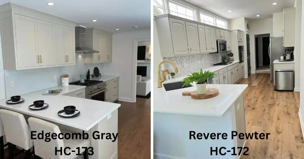
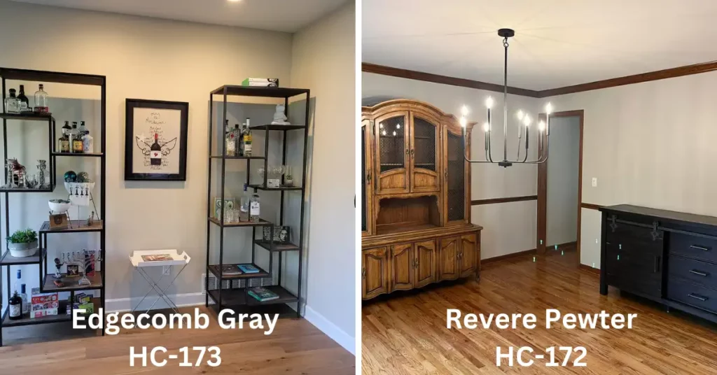
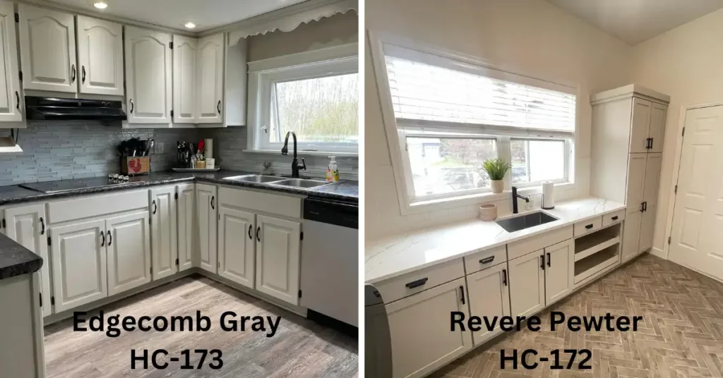
Warm and Inviting Edgecomb Gray, also known as (972, OC-15), a classic Benjamin Moore shade, leans towards a warmer hue. It has a subtle undertone of beige that adds a touch of warmth to the space. This color works wonders in rooms with ample natural light, creating an inviting and cozy atmosphere. Edgecomb Gray pairs well with white trim and wood accents, making it an excellent choice for traditional and farmhouse-style interiors.
Revere Pewter
Timeless Elegance On the other hand, Revere Pewter, also known as (973), is a timeless and popular gray shade. It leans towards a cooler tone with hints of green and beige undertones. This color adapts beautifully to various lighting conditions, appearing warmer in natural light and cooler in artificial light. Revere Pewter is a versatile choice that suits both modern and traditional interiors. It pairs exceptionally well with crisp white trim and provides an elegant and sophisticated backdrop for your decor.
Comparison Between: Edgecomb Gray and Revere Pewter
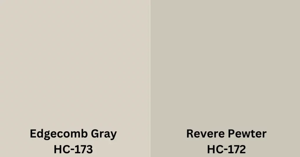
- Undertones: While both colors fall within the greige spectrum, Edgecomb Gray leans slightly more towards beige with its yellow undertones. Revere Pewter, on the other hand, has a greener undertone. Consider your space’s existing color scheme and lighting conditions to determine which undertone will work best.
- Lighting Conditions: Edgecomb Gray tends to appear lighter and more beige in well-lit areas, while Revere Pewter can have a cooler gray appearance in the same lighting conditions. If you have ample natural light in your space, Edgecomb Gray may create a brighter and airier feel. Revere Pewter can add warmth and coziness in rooms with less natural light.
- Complementing Colors: Both Edgecomb Gray and Revere Pewter are highly versatile when it comes to pairing them with other colors.
Edgecomb Gray pairs well with soft whites, warm creams, and muted pastels, creating a soothing and harmonious palette. It also works beautifully with deeper shades of gray, taupe, and even navy blue, adding depth and contrast to the overall design. Apart from Edgecomb Gray, you can also check Wickham Gray vs Gray Owl to get an even better idea about more gray finishes.
On the other hand, Revere Pewter harmonizes effortlessly with crisp whites, cool grays, and soft blues, creating a serene and sophisticated look. It also complements rich earth tones, such as deep browns and olive greens, for a more grounded and organic aesthetic.
Table of Differences
Now that we have explored the individual qualities of Edgecomb Gray and Revere Pewter, let’s compare them side by side to help you determine which color may be more suitable for your home.
| Specification | Edgecomb Gray | Revere Pewter |
| Color Family | Greige | Greige |
| Undertones | Warm | Warm |
| RGB Values | R: 218, G: 209, B: 196 | R: 204, G: 196, B: 184 |
| LRV | 64.76% | 55.98% |
| HEX Value | #dad1c4 | #ccc4b8 |
| Hue Angle | 63 degrees | 67 degrees |
| Warmth Level | Medium | Medium |
| Comparisons | Slightly lighter and warmer than Revere Pewter | Slightly darker and cooler than Edgecomb Gray |
| Color Depth | Slightly lighter with a soft, airy feel | Slightly darker with a more grounded presence |
Consider the existing color scheme and furnishings in your space when choosing between Edgecomb Gray and Revere Pewter. While both colors are versatile, they may have different effects on the overall ambiance and style you wish to achieve.
Color Combination
Edgecomb Gray and Revere Pewter are by Benjamin Moore. While they belong to the same neutral color family, they have slight differences in their undertones, which can affect a space’s overall look and feel. Here are some color combinations that work well with Edgecomb Gray and Revere Pewter:
Edgecomb Gray Combinations:
- White and Edgecomb Gray: Pairing Edgecomb Gray with crisp white or off-white trim, ceilings, and furnishings creates a classic and timeless look.
- Soft Blues and Edgecomb Gray: Combine Edgecomb Gray with soft blue accents, such as light blue pillows, curtains, or accessories, to create a serene and coastal-inspired atmosphere.
- Warm Tones and Edgecomb Gray: Incorporate warm tones like terracotta, rust, or caramel in furniture, rugs, or artwork to add warmth and depth to a space while maintaining a balanced color scheme.
Revere Pewter Combinations:
- Crisp Whites and Revere Pewter: Revere Pewter pairs well with bright whites, creating a clean and modern aesthetic. Use white trim, furniture, and decor to contrast with the warmth of Revere Pewter.
- Navy Blue and Revere Pewter: Combining Revere Pewter with navy blue accents adds depth and sophistication to a space. Consider using navy blue pillows, rugs, or statement furniture pieces to create a striking contrast.
- Soft Greens and Revere Pewter: Revere Pewter can also be paired with soft, muted greens like sage or moss for a calming and natural color scheme. Incorporate these greens in upholstery, curtains, or planters for a soothing atmosphere.
Edgecomb Gray vs Revere Pewter: Which One To Choose?
Choosing between Edgecomb Gray and Revere Pewter ultimately depends on your personal preferences, the lighting in your space, and the overall aesthetic you want to achieve. Both colors are popular choices and have their own unique qualities. Here are some factors to help you decide:
- Understand Your Style and Desired Atmosphere:
- If you prefer a more calming and versatile feel, Edgecomb Gray might be a good choice.
- If you want a sophisticated and timeless look, Revere Pewter could be a better fit.
- Consider Lighting Conditions:
- Edgecomb Gray tends to adapt well to different lighting conditions. It can appear slightly cooler in north-facing rooms but remains versatile overall.
- Revere Pewter has the ability to adapt to different lighting conditions, sometimes appearing more beige in warm light and cooler in cool light.
- Overall Look:
- Edgecomb Gray creates a serene and calming atmosphere, making it an excellent choice for bedrooms, living rooms, or any space where you want a relaxing vibe.
- Revere Pewter creates a sophisticated and timeless look. It works well in both traditional and contemporary spaces, adding depth and warmth.
- Get samples:
- Purchase sample pots of both colors and paint swatches on your walls
- Observe how they look in different lighting conditions throughout the day.
- Test with other elements:
- Consider the furniture, flooring, and other elements in the room.
- See how Edgecomb Gray and Revere Pewter interact with those elements and if they enhance or clash with them.
Remember that colors can appear differently based on lighting conditions and individual preferences. It’s always a good idea to test the colors in your own space to make an informed decision that aligns with your vision.
Final Words
Finally, when selecting color combinations, it’s important to consider the lighting conditions in your space, the style you want to achieve, and your personal preferences. It’s always a good idea to test paint samples and see how they look in your specific environment before making a final decision.

S. Pushon is a paint expert, self-taught artist, and currently working as an adviser in the paint industry as a Quality Improvement and Development Assistant.
An artist by heart, he draws remarkable art pieces and as a professional paint industry individual, he seeks the insight and shares with enthusiasts. Read more…
