In interior design, the importance of paint colors cannot be overstated. The right hue can set the tone, create ambiance, and influence how we perceive a space. Among the vast palette of options, Sherwin Williams has consistently provided quality paints, offering shades that cater to many preferences.
Two popular choices, Shell White and Alabaster, may appear similar at first glance. Still, they each possess their own unique characteristics that can significantly impact the look and feel of a room.
This comprehensive guide will delve into the nuances of these two paints, exploring their differences in undertones, versatility, mood-setting capabilities, and more.
The Differences Between Shell White and Alabaster
Sherwin Williams, a well-known name in paint, offers a variety of shades that might appear similar at first glance but possess distinctive characteristics. The following are 10 variations within Shell White and Alabaster paint:
The Subtle Dance of Undertones
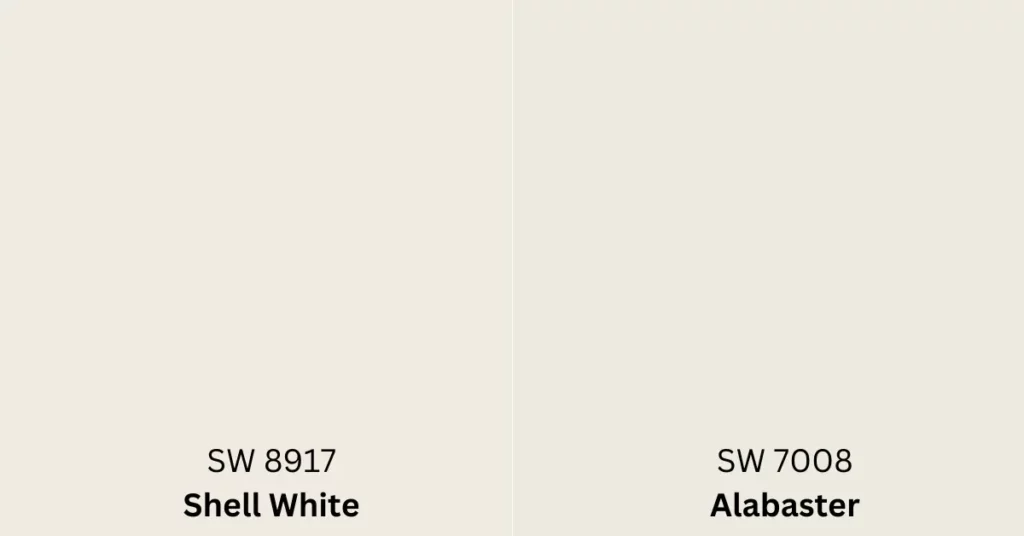
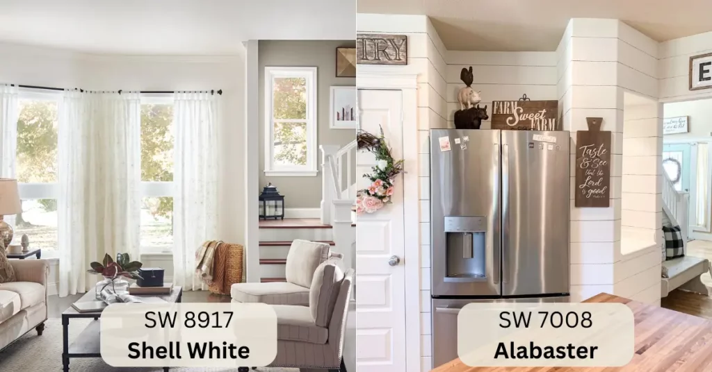
Shell White presents an inviting canvas with undertones that blend cream and beige gracefully. This delicate fusion of hues imparts a subtle warmth to the walls, making the space feel cozy and welcoming.
On the other hand, Alabaster takes a crisper approach by introducing a touch of warmth to its neutral base. The result is a color that is both clean and inviting, allowing it to seamlessly integrate into a range of design styles.
Playing with Light
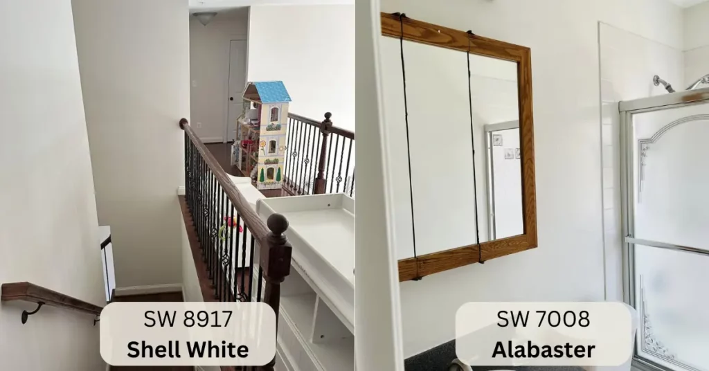
Both Shell White and Alabaster exhibit remarkable versatility in lighting conditions. Shell White boasts adaptability, gracefully transitioning from the soft embrace of natural light to the more artificial glow of indoor illumination.
In its own right, Alabaster maintains its pristine appearance even when faced with dimmer lighting, ensuring that the room always looks polished.
The Reflective Touch
When it comes to reflective qualities, Alabaster takes the lead. Its higher reflective index works wonders in spaces where light enhancement is a priority. Alabaster’s ability to bounce light around can make even smaller rooms feel more open and airier.
In contrast, Shell White offers a more subdued reflection that can create a sense of coziness, perfect for spaces where a touch of intimacy is desired.
Color Coordination Made Easy
Both Shell White and Alabaster are known for their versatility in pairing with other colors. Shell White effortlessly harmonizes with earthy tones and pastels, creating a serene and balanced environment.
With its neutral but warm disposition, Alabaster serves as an ideal backdrop for warm and cool color palettes. This adaptability gives you the creative freedom to experiment with various color schemes.
Textures and Tones
The undertones of Shell White hold the power to emphasize textures, particularly when combined with natural finishes like wood. The subtle warmth of the color can accentuate the tactile appeal of surfaces, inviting touch and interaction.
While equally capable of enhancing textures, Alabaster leans towards a more modern aesthetic, creating a sophisticated canvas for contemporary design elements.
Making a Statement
In the realm of visual impact, Shell White and Alabaster each offer a unique presence. Shell White’s subdued elegance lends a classic and timeless feel to a room, evoking a sense of tranquility.
In contrast, Alabaster’s brighter demeanor adds a touch of contemporary charm, making a statement without overpowering the overall design. The choice between these two paints can significantly influence the mood you want to create in your space.
Setting the Mood
The mood and atmosphere of a room are greatly influenced by its color scheme. With its delicate warmth, Shell White is a prime choice for bedrooms and cozy spaces where relaxation is key. Its calming influence can help create a sanctuary-like environment.
With its brighter and more energetic vibe, Alabaster is perfect for areas where you want to encourage activity and engagement, such as living rooms or kitchens.
Architectural Brilliance
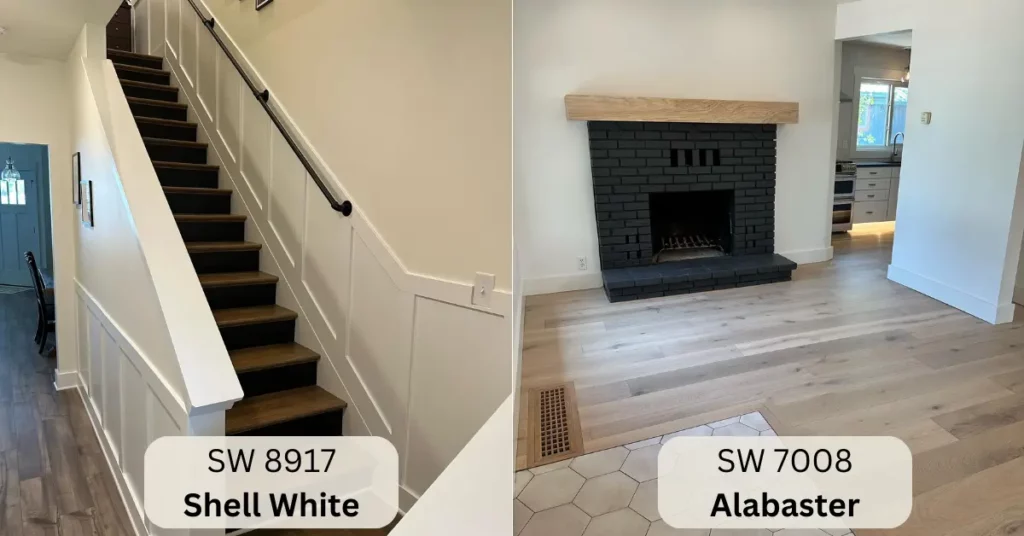
The architectural features of a room often serve as its visual focal points. Shell White can accentuate these features, such as moldings and trims, giving them a sculptural prominence.
With its clean and neutral disposition, Alabaster offers a seamless backdrop that allows these architectural elements to shine without distraction. The choice between these paints can thus affect the overall visual hierarchy of your space.
Furniture Affinity
Regarding furniture pairing, both Shell White and Alabaster have their strengths. Shell White’s warm undertones create a harmonious blend with traditional and rustic furniture, fostering a cozy and inviting atmosphere.
Alternatively, Alabaster’s neutral base offers a clean canvas for a broader range of furniture styles, from minimalist to eclectic, allowing your furnishings to take center stage.
Personal Aesthetics
The ultimate decision between Shell White and Alabaster rests on personal preference. Shell White leans toward traditional elegance with its subtle warmth, appealing to those who gravitate toward classic aesthetics.
Alabaster, with its clean neutrality and touch of warmth, suits modern sensibilities, offering a canvas for contemporary design visions. The choice between these paints provides an opportunity to express your individual style.
Explore Alabaster from the two most popular brands in the USA.
Comparison Table of Shell White Vs Alabaster:
| Differences | Shell White | Alabaster |
|---|---|---|
| Undertones | Cream and beige blend, subtle warmth | Neutral base with a touch of warmth |
| Versatility in Lighting | Adapts well to natural and artificial light | Maintains appearance in various lighting |
| Reflective Qualities | Subdued reflection, adds coziness | Higher reflection for enhanced brightness |
| Color Coordination | Harmonizes with earthy tones and pastels | Neutral canvas for both warm and cool tones |
| Texture Emphasis | Accentuates textures, inviting tactile appeal | Enhances textures, leans towards modern |
| Visual Impact | Subdued elegance, classic and timeless | Bright, contemporary and statement-making |
| Mood Setting | Tranquil and cozy, ideal for bedrooms | Energetic and inviting, suitable for activity |
| Architectural Focus | Highlights details, adds sculptural prominence | Offers seamless backdrop for architectural features |
| Furniture Pairing | Complements traditional/rustic furniture | Adaptable to various furniture styles |
| Personal Aesthetics | Appeals to classic elegance | Aligns with modern and contemporary visions |
| Overall Effect | Subtle warmth and intimacy | Crisp neutrality with a touch of warmth |
Using Shell White and Alabaster Paints to Make Your Space Yours
In the intricate world of interior design, the differences between Sherwin Williams Shell White and Alabaster paints go beyond the surface. These two seemingly similar colors offer distinct undertones, moods, and reflective qualities that can transform any space.
The choice between Shell White’s delicate warmth and Alabaster’s crisp neutrality can shape your room’s ambiance, texture emphasis, and overall visual impact. As you embark on your design journey, consider the nuances of these paints and how they align with your personal vision.
Whether you’re drawn to the timeless elegance of Shell White or the contemporary allure of Alabaster, your choice will undoubtedly leave a lasting impression on your living space.

S. Pushon is a paint expert, self-taught artist, and currently working as an adviser in the paint industry as a Quality Improvement and Development Assistant.
An artist by heart, he draws remarkable art pieces and as a professional paint industry individual, he seeks the insight and shares with enthusiasts. Read more…
